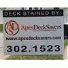
bigchaz 157 Report post Posted March 17, 2007 Square or Round - see attachments Share this post Link to post Share on other sites
0 We Wash Concrete 64 Report post Posted March 17, 2007 My vote's the 2nd one, for sure. Share this post Link to post Share on other sites
0 Integrity Curb Appeal 64 Report post Posted March 17, 2007 Square- 1. The logo resembles a deck. 2. The round could be mistaken for ASD Scott Share this post Link to post Share on other sites
0 Jeff 232 Report post Posted March 17, 2007 Square-1. The logo resembles a deck. 2. The round could be mistaken for ASD Scott Pretty much agree Share this post Link to post Share on other sites
0 We Wash Concrete 64 Report post Posted March 17, 2007 Seeing those two points being brought out, I reverse my vote. I liked the second one because the first thing I thought when I saw the first logo was "ADT" because the font resembles the ADT security company logo, with the letters overlapping. But I can also see where the 2nd logo could be confused with "ASD", and I like the square deck background. In my opinion, see if you can change the ADS on the first logo so it doesn't resemble "ADT" so much, but that's just me. Share this post Link to post Share on other sites
0 SPW Clean 14 Report post Posted March 17, 2007 I agree, the first one resembles a deck. What did you use to create your logo? Share this post Link to post Share on other sites
0 bigchaz 157 Report post Posted March 17, 2007 Interesting that yall think the first one resembles a deck. Never thought of it that way, but If it does thats all the better I suppose SPW: These were designed by the crew at designoutpost.com since I have no creative talent Share this post Link to post Share on other sites
0 Beth n Rod 1,279 Report post Posted March 18, 2007 In this case...it's hip to be square! Very cool. Beth Share this post Link to post Share on other sites
0 HotShot 34 Report post Posted March 18, 2007 I like the 2nd one better, but it is a bit confusing with the letters. If you go with the first one I would suggest really making it wood looking.... ps- don't listen to us!! We will drive you crazy on which logo to go with, just pick the one you like and go with it. Trust me, you'll thank me later if you do this. Ask me how I know... Share this post Link to post Share on other sites
0 Littlefield 65 Report post Posted March 18, 2007 I like the square, nice design work. Share this post Link to post Share on other sites
0 RPetry 564 Report post Posted March 18, 2007 Charlie, Always the contrarian, I voted for #2. A square with block letters is a bit simple looking, but maybe with a wood grain background it would be better. BTW I don't know squat about design or any of this stuff. Share this post Link to post Share on other sites
0 bigchaz 157 Report post Posted March 20, 2007 Haha thanks guys for voting. I think I realize what you were talking about Anthony. I think I changed my mind 10 times back and forth on some of these logos. At first I really wanted the square one but I ended up going with the circle one. Someone else made a really good point about cutting vinyl and embroidery, which will be much easier with the circle. By the way, anyone looking for a great way to professionalize your business, a logo is def great. Design Outpost - Graphic Design Firm - Logos, Templates, Print Material, and More is amazing for this. I bid 130 bucks and had probably around 12 different entries. Nothing beats that for the money Logoholik is the name of the designer on there who worked with me on a dozen revisions and sent me the files in 10 different formats. I recommend him 100% If you guys want to know more ask me Cant wait to get this on biz cards, website, postcards, and apparal! Share this post Link to post Share on other sites
0 James 624 Report post Posted March 21, 2007 I like BigChaZz.." ChaZz up your deck" Share this post Link to post Share on other sites
0 PLD 14 Report post Posted March 21, 2007 Seeing those two points being brought out, I reverse my vote. I liked the second one because the first thing I thought when I saw the first logo was "ADT" because the font resembles the ADT security company logo, with the letters overlapping. But I can also see where the 2nd logo could be confused with "ASD", and I like the square deck background. In my opinion, see if you can change the ADS on the first logo so it doesn't resemble "ADT" so much, but that's just me. I voted #2, because #1 has been done by 100 companies before. Share this post Link to post Share on other sites
0 bigchaz 157 Report post Posted March 23, 2007 Can this get closed? I dont need the poll anymore and it keeps bumping this thread back up Share this post Link to post Share on other sites
0 James 624 Report post Posted March 24, 2007 How about"Charlie'S Wood Angels" and three babes show up to do woodycare!! I can see the outfits now......... and the process !! Share this post Link to post Share on other sites
0 bigchaz 157 Report post Posted March 24, 2007 You find me three babes and ill gladly redo my entire business!! Share this post Link to post Share on other sites

Square or Round - see attachments
Share this post
Link to post
Share on other sites